# 圓餅圖
餅圖通過將一個圓餅按照分類的佔比劃分成多個區塊,整個圓餅代表 數據的總計,每個區塊鏈(圓弧)表示該分類占總體的比例大小,所有區塊鏈(圓弧)的加和等於100%。可以很好地幫助用戶快速了解數據的佔比分配。
# 基礎圓餅圖
### 預覽圖
---
[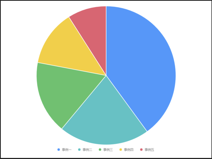](https://book.gosu.bar/uploads/images/gallery/2019-12/J5S36Cr3Qy9iEVVb-%E5%9F%BA%E7%A4%8E%E5%9C%93%E9%A4%85%E5%9C%96.png)
### 設定值
---
- #### 資料源
```
[{
item: '事例一',
count: 40,
percent: 0.4
}, {
item: '事例二',
count: 21,
percent: 0.21
}, {
item: '事例三',
count: 17,
percent: 0.17
}, {
item: '事例四',
count: 13,
percent: 0.13
}, {
item: '事例五',
count: 9,
percent: 0.09
}]
```
- #### 內距
```
20, 20, 50, 20
```
- #### 圖 Geom
##### 柱狀圖( interval )
| 列表 | 設定值 |
| 欄位 | count
|
| 類型 | 柱狀圖 |
| 顏色欄位 | item
|
| 調整欄位 | 堆疊 | stack |
| 樣式 - 顏色 | \#ffffff |
| 樣式 - 寬度 | 2 |
- #### 圖示 Legend
| 列表 | 設定值 |
| 啟用 | 開啟 |
| 欄位 | count |
| 位置 | 下 |
| 排版 | 水平 |
| 垂直偏移量 | -40 |
- #### 極坐標 Coord
# 基礎圓環圖
環圖,其本質是餅圖將中間區域挖空。
餅圖的整體性太強,我們會將注意力集中在比較餅圖內各個扇形之間佔整體比重的關係。但如果我們將兩個餅圖放在一起,餅圖很難同時對比兩個圖。環圖在解決上述問題時,採用了讓我們更關注長度而不是面積的做法。這樣我們就能相對簡單的對比不同的環圖。同時環圖相對於餅圖空間的利用率更高,比如我們可以使用它的空心區域顯示文本信息,比如標題等。
### 預覽圖
---
[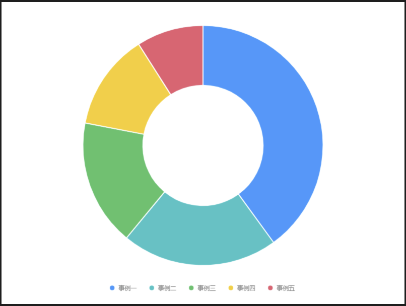](https://book.gosu.bar/uploads/images/gallery/2019-12/bN9Ydq3cTyQR2zW9-%E5%9F%BA%E7%A4%8E%E5%9C%93%E7%92%B0%E5%9C%96.png)
### 設定值
---
- #### 資料源
```
[{
item: '事例一',
count: 40,
percent: 0.4
}, {
item: '事例二',
count: 21,
percent: 0.21
}, {
item: '事例三',
count: 17,
percent: 0.17
}, {
item: '事例四',
count: 13,
percent: 0.13
}, {
item: '事例五',
count: 9,
percent: 0.09
}]
```
- #### 內距
```
20, 20, 50, 20
```
- #### 圖 Geom
##### 柱狀圖( interval )
| 列表 | 設定值 |
| 欄位 | count
|
| 類型 | 柱狀圖 |
| 顏色欄位 | item
|
| 調整欄位 | 堆疊 | stack |
| 樣式 - 顏色 | \#ffffff |
| 樣式 - 寬度 | 2 |
- #### 圖示 Legend
| 列表 | 設定值 |
| 啟用 | 開啟 |
| 欄位 | count |
| 位置 | 下 |
| 排版 | 水平 |
| 垂直偏移量 | -40 |
- #### 極坐標 Coord
# 單色南丁格爾玫瑰圖
南丁格爾玫瑰圖,又名雞冠花圖、極坐標區域圖,是南丁格爾在克里米亞戰爭期間提交的一份關於士兵死傷的報告時發明的一種圖表,是在極坐標下繪製的柱狀圖,使用圓弧的半徑長短表示數據的大小(數量的多少)。
由於半徑和面積的關係是平方的關係,南丁格爾玫瑰圖會將數據的比例大小誇大,尤其適合對比大小相近的數值;由於圓形有周期的特性,所以玫瑰圖也適用於表示一個週期內的時間概念,比如星期、月份。
### 預覽圖
---
[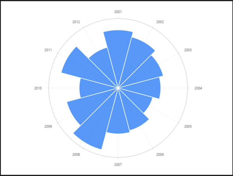](https://book.gosu.bar/uploads/images/gallery/2019-12/8sWkFsNW586LdBYk-%E5%96%AE%E8%89%B2%E5%8D%97%E4%B8%81%E6%A0%BC%E7%88%BE%E7%8E%AB%E7%91%B0%E5%9C%96.png)
### 設定值
---
- #### 資料源
```
[{
year: '2001',
population: 41.8
}, {
year: '2002',
population: 38
}, {
year: '2003',
population: 33.7
}, {
year: '2004',
population: 30.7
}, {
year: '2005',
population: 25.8
}, {
year: '2006',
population: 31.7
}, {
year: '2007',
population: 33
}, {
year: '2008',
population: 46
}, {
year: '2009',
population: 38.3
}, {
year: '2010',
population: 28
}, {
year: '2011',
population: 42.5
}, {
year: '2012',
population: 30.3
}]
```
- #### 內距
```
60, 40, 60, 50
```
- #### 軸座標 Axis
##### population( Y軸 )
- #### 圖 Geom
##### 柱狀圖( interval )
| 列表 | 設定值 |
| 欄位 | year\*population
|
| 類型 | 柱狀圖 |
| 樣式 - 顏色 | \#ffffff |
| 樣式 - 寬度 | 2 |
- #### 極坐標 Coord
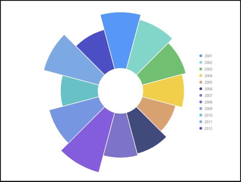
# 多色南丁格爾玫瑰圖
### 預覽圖
---
[](https://book.gosu.bar/uploads/images/gallery/2019-12/Jg30Ykq35EmiHNCN-%E5%A4%9A%E8%89%B2%E5%8D%97%E4%B8%81%E6%A0%BC%E7%88%BE%E7%8E%AB%E7%91%B0%E5%9C%96.png)
### 設定值
---
- #### 資料源
```
[{
year: '2001',
population: 41.8
}, {
year: '2002',
population: 38
}, {
year: '2003',
population: 33.7
}, {
year: '2004',
population: 30.7
}, {
year: '2005',
population: 25.8
}, {
year: '2006',
population: 31.7
}, {
year: '2007',
population: 33
}, {
year: '2008',
population: 46
}, {
year: '2009',
population: 38.3
}, {
year: '2010',
population: 28
}, {
year: '2011',
population: 42.5
}, {
year: '2012',
population: 30.3
}]
```
- #### 內距
```
0
```
- #### 軸座標 Axis
##### population( Y軸 )
##### year( X軸 )
- #### 圖 Geom
##### 柱狀圖( interval )
| 列表 | 設定值 |
| 欄位 | year\*population
|
| 類型 | 柱狀圖 |
| 顏色欄位 | year |
| 樣式 - 顏色 | \#ffffff |
| 樣式 - 寬度 | 2 |
- #### 圖示 Legend
| 列表 | 設定值 |
| 啟用 | 開啟 |
| 欄位 | year |
| 位置 | 右 |
| 排版 | 垂直 |
| 水平偏移量 | -160 |
| 垂直偏移量 | -160 |
- #### 極坐標 Coord
# 南丁格爾玫瑰圓環圖
### 預覽圖
---
[](https://book.gosu.bar/uploads/images/gallery/2019-12/vjCzmHa4z9BydwAQ-%E5%8D%97%E4%B8%81%E6%A0%BC%E7%88%BE%E7%8E%AB%E7%91%B0%E5%9C%93%E7%92%B0%E5%9C%96.png)
### 設定值
---
- #### 資料源
```
[{
year: '2001',
population: 41.8
}, {
year: '2002',
population: 38
}, {
year: '2003',
population: 33.7
}, {
year: '2004',
population: 30.7
}, {
year: '2005',
population: 25.8
}, {
year: '2006',
population: 31.7
}, {
year: '2007',
population: 33
}, {
year: '2008',
population: 46
}, {
year: '2009',
population: 38.3
}, {
year: '2010',
population: 28
}, {
year: '2011',
population: 42.5
}, {
year: '2012',
population: 30.3
}]
```
- #### 內距
```
0
```
- #### 軸座標 Axis
##### population( Y軸 )
##### year( X軸 )
- #### 圖 Geom
##### 柱狀圖( interval )
| 列表 | 設定值 |
| 欄位 | year\*population
|
| 類型 | 柱狀圖 |
| 顏色欄位 | year |
| 樣式 - 顏色 | \#ffffff |
| 樣式 - 寬度 | 2 |
- #### 圖示 Legend
| 列表 | 設定值 |
| 啟用 | 開啟 |
| 欄位 | year |
| 位置 | 右 |
| 排版 | 垂直 |
| 水平偏移量 | -160 |
| 垂直偏移量 | -160 |
- #### 極坐標 Coord