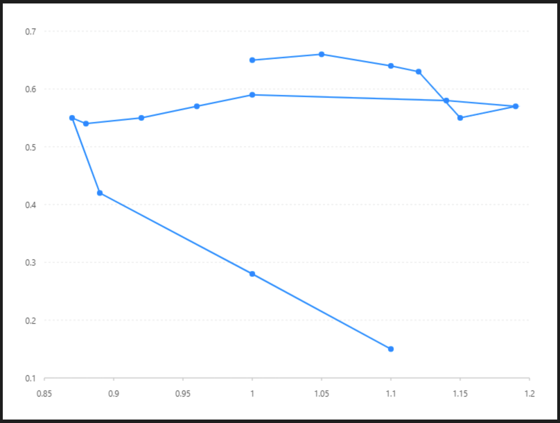
路徑圖
折線圖數據是遞增還是遞減、增減的速率、增減的規律(週期性、螺旋性等)、峰值等特徵都可以清晰地反映出來。所以,折線圖常用來分析數據隨時間的變化趨勢,也可用來分析多組數據隨時間變化的相互作用和相互影響。例如可用來分析某類商品或是某幾類相關的商品隨時間變化的銷售情況,從而進一步預測未來的銷售情況。在折線圖中,一般水平軸(X軸)用來表示時間的推移,並且間隔相同;而垂直軸(Y軸)代表不同時刻的數據的大小。
預覽圖
設定值
-
資料源
[{
  {consumption: 0.65,
  price: 1,
  year: '1991', value: 31965
}, {
  consumption: 0.66,
  price: 1.05,
  year: '1992', value: 41966
}, {
  consumption: 0.64,
  price: 1.1,
  year: '1993', value: 3.51967
}, {
  consumption: 0.63,
  price: 1.12,
  year: '1994', value: 51968
}, {
  consumption: 0.55,
  price: 1.15,
  year: '1995', value: 4.91969
}, {
  consumption: 0.57,
  price: 1.19,
  year: '1996', value: 61970
}, {
  consumption: 0.58,
  price: 1.14,
  year: '1997', value: 71971
}, {
  consumption: 0.59,
  price: 1,
  year: '1998', value: 91972
}, {
  consumption: 0.57,
  price: 0.96,
  year: '1999'1973
}, value:{
  13consumption: 0.55,
  price: 0.92,
  year: 1974
}, {
  consumption: 0.54,
  price: 0.88,
  year: 1975
}, {
  consumption: 0.55,
  price: 0.87,
  year: 1976
}, {
  consumption: 0.42,
  price: 0.89,
  year: 1977
}, {
  consumption: 0.28,
  price: 1,
  year: 1978
}, {
  consumption: 0.15,
  price: 1.1,
  year: 1979
}]-
內距
40,20,50,50 40, 60, 60比例尺Scale
Year 比例尺( X軸 )
year
Value 比例尺( Y軸 )
類型
-
圖 Geom
線圖(路徑圖( Line )path)
| 列表 | 設定值 |
|
欄位 |
|
| 類型 |
點圖( point )
| 列表 | 設定值 |
| 欄位 | |
| 類型 | 點圖 |
| 形狀 | circle |
| 大小 | 4 |